21/11/2016

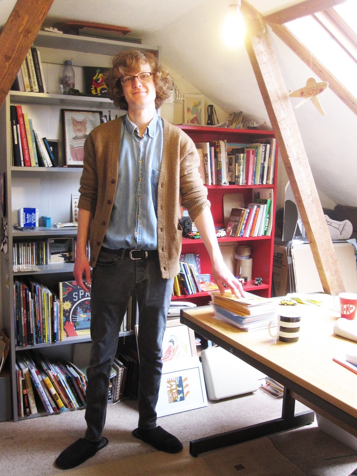
Q&A with Paul Bommer


Q. Tell me about your route into illustration?
A. Well I have always drawn since earliest memory really, always been drawing, and as a child I imagined it was something I was going to do a as a career, but then family pressures intervened and it wasn’t an option or a job. My father and three of my siblings were all engineers so I followed that route for a while and did an engineering degree. I worked in it for three years but I knew as soon as I started that I loathed it and was saving money while I was there to get me to Art College. So after three years I got out and did a fine art degree in painting at the National College of Art and Design, NCAD, in Dublin. When I returned to London I did a number of small jobs and had a studio on the side. At that time I was really trying to be a painter and then discovered that computers were a way of getting this stuff across much faster and this led to illustration. That was fine in the beginning, but then I began to feel that digital work killed the spirit of what I wished to create. I think that’s when printing came in, about 5 or 6 years ago. I looked into screen printing in London and found a studio, the Print Club in Dalston, which is where I started. I've been increasingly moving away from illustration since then (editorial or commercial illustrations in particular) into something more like fine art.


Q. Is that Fine Art?
A. Well, I don’t really know to be honest. I think printmaking straddles that, it’s quite a grey area. Lots of artists use printmaking, but somehow it’s still considered the poor cousin and not really respected like ‘unique’ pieces. Editioned work is generally thought of as a little bit lower than unique pieces, but not entirely. You can have prints that cost thousands and one offs, like mono prints, and then you can go right down to posters and flyers that are mass produced, and booklets. Print is a really broad church.

Q. I first saw your work in the Guardian magazine?
A. You probably did, I used to work for them quite often.


Q. When was that?
A. I used to work for the Guardian quite regularly before I moved up to Norfolk, so that would have been about five or six years ago. I did a weekly piece for them for a while and lots of covers for the supplements over time. They made a lot of redundancies at one point and moved their offices from Farringdon to Kings Cross and all the people who had commissioned me were let go. I didn’t really pursue it, I could have made fresh contacts, but there were always waves of new illustrators coming in and I decided I didn’t like the stress and pressure of commercial editorial illustration. I did enjoy the challenge of working within a brief and having certain constrains, but the work dried up and my enthusiasm for it dried up as well.


Q. Tell me about your process?
A. There are two strands. If I’m working for a commissioned piece the process involves creating roughs for approval and then final artwork. When I’m working on my own pieces I just work endlessly out of notebooks, I’m now on about 160. I’ve been using those since art college and
that’s over twenty years ago. I just work and work on ideas all the time and I try not to censor too much even though a lot of the ideas don’t necessarily make the grade as they wouldn’t always translate as an art piece or as a print. Different sorts of media suit different things, it may be something that has a limited audience and a painting or a mono print or a small edition might suit that better. Other imagery, like the tattooed sailors for instance, prove more popular and it’s okay to do bigger editions of those.


Q. So how does a picture come out of the notebook/sketchbook into the world, how does that process happen?
A. I often just do a very random scribble in the notebook, it may only be the size of a postage stamp, very small, and I will then scan that in and blow it up towards the size of print I’ve intended. I usually work in 3 sizes: A3, B2 (fifty by seventy cm) and mini (twenty cm square). As they get blown up certain things have to change, marks that just don’t work when they’re larger and so I work them up in the studio on the light box using technical drawing pens generally. The process is ongoing, I don’t just draw one thing, it starts out as something small and it grows piecemeal. I tend not to draw things as one image but in parts and then composite it together in Photoshop.

Q. Let's talk tiles, how did you come to be doing these?
A. I’ve always loved Delft tiles, I think even as a kid I was aware of them and just loved that look. Blue and white has always been very popular and it still is. A few years ago I had an exhibition in a Georgian house in Spitalfields and as a nod to the area and to the history of the house I did paintings that looked like Delft tiles (they were paintings on mdf boards and used crackle glazes to create the effect). I made 120 of those and they were all related to a website called ‘Spitalfields Life’ which I knew the author of and which dealt with that area particularly and its history. So I was referencing things that had been featured by the Gentle Author on that website, mentioning local manufacturers, artists, buildings and the churches there, etc. I was trying to reference the history in all its broad scale. They sold really well, but a lot of people didn’t get the fact that they weren’t real tiles and I got a lot of people asking if I would do ceramic tiles they could use in their bathrooms, hearth places, etc. I began a very slow process of exploring that and first of all started using transfers on shop bought tiles which I found very unsatisfactory. I did onglaze painting on premade tiles and eventually I just found the only way to get the look and feel of a genuine delft tile was to actually create the tile yourself and to paint it as it would have been done originally. Basically it took me about three or four years, intermittently as it definitely wasn’t the main focus of my work. I still use transfers for some sorts of tile making, but for the traditional blue and white delft tiles, I found the best thing was to go back to basics.


Q. So they’re like a mini painting?
A. They are. Each one is hand painted. Sometimes I use a template, called a spons, this is an image drawn on parchment which then has holes pricked in it through which you 'pounce' charcoal dust to leave an image on the tile that you can follow. Even if you use the same
template many times over you will always get slightly different end results, which is very pleasing.

Q. Let's talk tattoos... Do you have any?
A. Well, I’ve got a couple of small tattoos…


Q. We’ll have a look at those later... So you’ve used tattoos quite a bit in your work or its influenced your work?
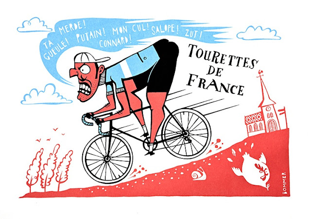
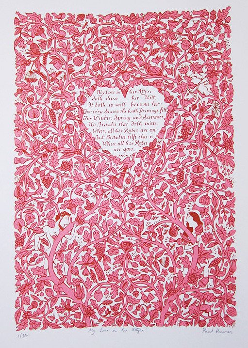
A. Yes that’s right, it really comes more from a fascination with symbolism than it does with tattoos exactly. I liked the way tattoos had meanings. Nowadays you can get anything you like, if there’s a singer you like, etc., but at one time it was associated with a lower class of people, criminals or sailors say, and everything had a meaning, things like tears or dice. They had significance and I like the idea of things reduced down to a symbol. That’s why I have a fascination with playing cards and pub signs as well, all that sort of thing. It is all related. Tattoos work really well in a print because there’s the idea of having a story within a story. You can have a print about something large, a figure maybe, and within that figure there can be other stories. And it hasn’t always been tattoos, I did some work for the London Guildhall who were having an exhibition of treasures held by the various trade guilds. The artwork showed a Guildhall Aldermen with these objects embroidered in gold thread onto his coat. So it was lots of small pieces, icons, within a larger piece. There was a lot to digest visually.


Q. What’s that art called? That includes pub signs, fairground images, it’s got a name?
A. I think that would be termed folk or popular art.

Q. How did you find out about Print to the People?
A. It was through meeting you, in fact. You came along to one of my first exhibitions in Norwich, at what was The Bell Jar in Upper St Giles Street and a week later I met you again at Get Stuffed Christmas Market at Stew. Before Print to the People came along Stew was the centre of printmaking in Norwich.


Q. And you’ve had some work produced through them?
A. I have indeed. I have had some tote bags, posters and prints produced there and have been part of both the Year in Print project and P2TP's 2017 Calendar. So an ongoing relationship there and one I would definitely like to continue.


Q. There’s a lot of humour in your work, has that made you happy?
A. It does when people get what I do. I made a decision a few years ago to do what I like to do and not tailor it to an audience. So I’m always slightly surprised and very delighted when people like or respond to my work.


Q. Where do you find inspiration?
A. All over the place really, it’s difficult to say. I am influenced a lot by history and by nature. Although nature is so perfect I don’t attempt to try to imitate it, but I am inspired by it. I have
quite a medieval view of the world where you try to encapsulate or distil the essence of nature. I don’t really try to show landscapes.

Q. Do you collect anything?
A. Yes I do. I collect random ceramic pieces, jugs and vessels mostly. I’m very fond of them. The other things I collect are playing cards and tarot cards.


Q. Do you do readings?
A. No I don’t sadly. I was raised Catholic and taught they were a sin, they were evil (I don't still believe this!) but it’s the appeal of reductive symbolism that can be seen on lots of different levels. The pictures show one thing but may mean another and within one image there will be lots of disparate elements.


Q. How do you get past creative blocks?
A. When I feel them approaching I’m now more aware of them. There’s some work you can do when you’re not feeling so bright, sort of ‘donkey’ work. It’s good to do something else if you’re struggling with creative things and I find it's best to put down your pens and get away from it for a while. If you just carry on working relentlessly I think you burn out and that’s happened to me a number of times. So if I have a block I take a break.


Q. What are you working on now?
A. I’ve just finished a body of commissioned work and now I’m really trying to focus on what I’m going to do for next year, for the foreseeable. I’m trying to plan a different way of working where I focus more on creating the work I want to produce and exploring different techniques within printmaking, mark making and painting. I think what I’m really trying to do is find the the fun in it again. Not just the fun that comes across on the paper, but the enjoyment of the creative process itself, which can get so easily lost. That’s my main focus and I’m looking forward to next year and have momentarily stopped working in preparation for that. I'm laying out in front of me things that I could do and working out how best to proceed with that.

Q. Where do you sell your work?
A. I sell my work on my own Big Cartel online shop, and I also sell it through a number of galleries online and across the country. I’m having a pre-Christmas selling exhibition at the end of November, A Winter's Tale, at Nunns Yard in Norwich.


Q. What new medium would you like to try?
A. I’d like to explore intaglio etching, and wood block, which I think are related, that sort of direct impress printmaking. Different sorts of print media suggest different sorts of images. Risography, because it’s generally a simpler process, makes me think of pamphlets and posters, that sort of thing, a broader, more popular kind of avenue. Screenprinting and wood cut or intaglio would be higher end, more limited. All sorts of things to explore. I’d like to do more letterpress as well but I haven’t thought of a project that could really use that to best advantage.


Q. What artist do you admire?
A. I have current favourites, but over time there have been lots of artists whose works I have admired and they have been absorbed into what I do as influences. I’d say that Edward Bawden is still a massive influence and I like the levity, humour and invention of his earlier work particularly, which I think is slightly overlooked and Edward Lear, I love his drawings a lot. There’s also a Czech illustrator called Jiri Salamoun, I’ve got a couple of his pieces here that are from the sixties, film posters, and I really love his work because he just rips up all the conventions and isn't worried about issues of perspective or making sense, scale, that sort of thing. In a way it reminds me again of that medieval approach even though it’s very much art of the sixties. He’s still around now in his eighties or nineties.

Q. What is your favourite Bowie song?

01/11/2016

Q&A with Jane Kemp


Q. Tell me about your route into illustration?
A. After moving up from London around 16 years ago and bringing up my 4 children I needed a new challenge. I had previously been a surface pattern designer in the rag trade when I lived in London but now I wanted something new to do. I started by joining a local watercolour group which was just once a week this then lead to me enrolling at City College in Norwich to do the Access to Art and Design course which was a full time course which was completed in a year.

Q. Like a Foundation?
A. Yeah. You do a bit of textiles, sculpture, a bit of everything print, graphics, life drawing, and it was during this course that I wanted to take on a bit more and I applied to do Illustration at NUA. I think it was being back at college and doing something creative again, I didn’t want to stop. I had to wait for my youngest children got into high school so I deferred for a year and then started my degree at NUA.

Q. And when did you finish that?
A. Two years ago.

Q. Can you tell me about your process?
A. My process is print based. I’m quite flexible in what print I use, but at the moment it’s mainly lino cut. And I do some screen printing.

Q. How do you get to an image for lino cut?
A. I sketch first, I always start with sketching. I have my idea, go and reference it, research it, sketch, then try and work out in black and white, because that’s generally what you have to do with lino. Once I get my final design, final size, I then trace everything because in lino you have to work in reverse. I just use the tracing paper to help me to work it out, see how it’s going to look and then just draw it onto the lino block before I cut away, and sometimes when you’re doing it you’ll change it as you go along because it might not look right and you often have to take a  print of the image and then make adjustments because it’s not quite right.


Q. Why would you decide to do a screenprint rather than a linocut?
ALino cut is quite chunky, it is very difficult to get fine detail with lino, but as a way of working it is very therapeutic. I really enjoy the process of cutting away at the lino as the image develops and there is always a bit of a surprise when you finally get to print. 


Q. So you do your linos here in your studio and otherwise you do your screenprinting at Print to the People?
A. Yes, I work in my studio at home. I have a small press I can use for my lino cuts or I print by hand if they are bigger than A4. But if I want to screen print then I use the excellent facilities at Print to the People.

Q. How did you find out about Print to the People?
A. It was through the university. It was promoted so that we knew we would still be able to use printing facilities after graduation.


Q. Where do you find inspiration?
A. In lots of places. Books, vintage magazines, I look at a lot of old stuff really. I love museums and spend time there looking for inspiration. I have recently screen printed a series of Toby Jugs which started when I saw one at the Castle museum in Norwich and then a friend mentioned that she had a collection of them  which I photographed. This is the starting point for a project. 


Q. Because you’ve done other museum stuff haven’t you?
A. I have because I really love museums. I love going to them and I love looking around, and when I was at Uni I did a project on the Bridewell Museum on the weaving loom. And then for my final project I went to the John Jarrold Printing Museum.

Q. How did you find out about that?
A. A tutor told me about it because I didn’t know it existed. And it was an  absolutely fabulous museum.

Q. What do you do there and what you like about it?
A. The John Jarrold Printing Museum is a working museum run by retired print workers, just down by the river at Whitefriars and it has been going since about 1982. It shows you how print was in its hey day before it moved over to computers. It is filled with working print machines from early Stanhope presses to later motorised Heidelberg machines. They also have lots of type, wooden and metal of varying sizes, draws and draws of it. When you walk in it smells of printing ink and it is laid out as it would off all those years ago with a composing area first with the tall cabinets with sloping tops into the printing area with a variety of machines ending up with the bindery section. 
I went into the museum for my final project at university and originally taped them talking about there experiences in the print trade. A lot of them were quite similar enrolling at 15 and doing the 7 year apprenticeship. This became the start of my project which ended up with me producing an A3 size concertina book based on the museum with lino cut illustrations.


Q. It’s still owned by the Jarrold's family?
A. Yes, it’s still in the Jarrold’s family and Caroline and Peter come in a lot. Peter used to run the print works division, he’s really keen and he always comes in and asks about what you’re doing and shows an interest. And Caroline does the same, she’s interested in what people are up to.

Q. And what about type? Because I feel you have some sort of passion for it.
A. Yes, I do love type! When you work with a Mac you’ve just got this prescribed list of type and it’s all really boring and not very exciting, and then you look in an old type book or go to the museum and see the drawers of type and there’s such a different range it’s really exciting. And there’s something about printed type, letterpress, that’s much more exciting and tactile than something you can get off a computer. I get lots of ideas just from looking at type.


Q. So it’s not a sideline, it’s like another avenue?
A. Yes, I’d say it is one of my main interests actually. If I can I try and get type into my images. I have started to use letterpress as well. I recently purchased a small table top printer, an Adana 8x5. I also have bought some type and have started to produce letterpress greetings cards


Q. Do you collect anything?
A. Well because of my printing press I have stared to collect type, like these 3 boxes of Gill. Which is a favourite type face of mine, I use it a lot. I also have some really large letters that I pick up from boot fairs some are shop sign letters and I have a gigantic letter S which was a Safeway s that is now on my studio door.


Q. Is there something addictive about letterpress?
AYes there is. They are very tactile objects and so many varieties of type. I get very excited when I open up the drawers/cases in the museum or if I see some for sale. 
I have a condensed sans serif type in wood which is beautiful and this larger wooden type which has a similar look to Playbill, I got this from a boot fair for £8.
It feeds into the work I do, I have just printed the shipping forecast using lots of different typefaces.

Q. And you did a list of dogs didn’t you?
A. Yes, I love dogs and I did a series of lino cuts of different breeds and included the breed of the dog, so using type and image.


Q. How do you get past creative blocks?
A. I just go to a museum or look at a book. Just have a look out there.

Q. What are you working on now?
A. I have just completed a series of lino prints that are 10 by 10 cms for a print exhibition in Bury St. Edmunds in November.

Q. What new medium would you like to try?
A. Cyanotype. I went to a cyanotype workshop at Print to the People and I absolutely loved it. I really enjoyed the process and I love that blue you get. I did a print of eels because I like the story of eels and how they go to the Sargasso Sea to lay their eggs. I hadn’t known how to make an image of that, but using cyanotype worked very well. You use a black image on acetate and then expose it to treated paper, then you wash it off and your image comes out. I got really excited by that, it’s a nice process.


Q. Which artist do you admire?
A. Christopher Brown, Ed Klutz and Jonny Hannah all use lino cut and are very exciting illustrator/ artists.

Q. What is your favourite Bowie song?
A. Golden Years.


https://www.instagram.com/janekemp66/?hl=en


John Jarrold Printing Museum
Whitefriars Norwich Norfolk NR3 1SH

email: enquiries@johnjarroldprintingmuseum.org.uk

The Museum is open from 09.30 to 12.30 every Wednesday
and by special arrangement


Questions: Paul McNeill Editor: Yasmin Keyani


16/08/2016

Q&A with Toby Rampton


Q. Tell me about your route into illustration
A. I first got excited by illustration when I was on my Graphic Design BTEC course at college. My tutors were all from different backgrounds of work, I found it was quite interesting how you could cross-platform creative industries. Because illustration is quite collaborative you get to work with graphic designers, textile printers, all types of people. I enjoyed drawing and sort of drifted away from working at a computer and focused on sitting at a desk drawing, which has stuck quite well.


Q. You studied illustration at Anglia Ruskin University in Cambridge?
A. Yes, which was a brilliant decision, I enjoyed every moment of it, even the some of the bad bits and it was all a good learning curve.

Q. When did that finish? 
A. That finished in 2014. I spent three years there doing my BA course, got to meet some fantastic people and indulge in all of my interests of printmaking, doodling, location drawing.


Q. Tell me a bit about your process
A. My process is mostly printmaking, or reproducing printmaking method digitally, so I work in layers, quite a graphic way of working being really minimal and efficient with colour usage to help communicate an idea really quickly. I mostly work with screen printing, lino and risograph. 
People expect my work in sketch books to be really colourful but it’s mostly black so I can really quickly translate it into a screen print or scan it in and you just colour that way. So I have two different processes, one which is very labour intensive and slow, which is basically the screen printing process. The other is a much faster digital process of scanning original artwork and working it on my laptop. When I’m working digitally I sometimes hesitate and spend hours and hours fiddling with colours, so I try and keeping a hands on approach to speed up the process and make good decisions the first or second time.


Q. You used to screen print here on this table?
A. Yeah, I still like to but I do a lot of lo-tech printing here. I have to bring the water up a ladder to the studio.

Q. How did you find out about Print to the People?
A. I heard about them online when they were in Stew print rooms, but the studio looked a bit small. It’s small here and I’ve got what I need so I thought I’d carry on with my own thing here, no pressure. After hearing that PTTP had a new studio from someone at a Zine fair I popped over and thought the place looked brilliant, it’s got great facilities. I’d never done textile printing before so thought this was a great opportunity to get stuck in with that as well. And I saw they had just acquired a Risograph printer which I was very interested in learning about. After that I sent out a little screen printed envelope in the post to Jo who runs Print to the People and got involved with workshops shortly after.


Q. You’ve really jumped onto the Riso in your work? 
A. Yeah, I do drawings that are quite loose and having a printing process that’s reasonably instant and professional really helps compliment my designs. It’s quite a fun process if you just get stuck in with it and don’t over complicate things.


Q. Can you describe what Riso is in one sentence?
A very speedy stencil duplicator! It’s basically a cross between off-set lithography printing on inked up drums with the result of screen printing but at the speed of a photocopier. It’s a very economical way of printing, doesn’t use heat to set the inks at the end, everything’s done cold. It’s a very odd thing to describe, I’m sure some people will be scratching their heads, so I’d recommend going seeing one in the flesh because they are very weird but extraordinary things.


Q. Where do you find inspiration?
A. From general everyday stuff. I tend to keep either a sketchbook or a notebook with me as I go about and if I see something funny, sad or weird as I’m walking along that could spark off an idea. I tend to document things from day to day life. I also enjoy looking at mid-century art, picture books, especially 1960’s lithograph picture books. I believe bright, vibrant, bold, simple art work that communicates to children can work just as well with adults a lot of the time. 

Q. Can you name some names?
A. Dahlov Ipcar is an absolutely brilliant artist, Paul Rand, Helen Borton. There’s also a lot of international illustrators that are great to look at online.
When I was on my course at Anglia Ruskin, there’s also a really good children’s picture book course that they run, the only children’s picture book MA course in the UK and they had a lot of great books in their studio which you’d never find in a book shop here like Isabelle Vandenabeele, she’s brilliant!

Q. Do you collect anything?
A. I like collecting toys, toy cars mostly. I usually scoot around charity shops picking out stuff for as cheap as possible; I don’t like it to make it an expensive habit since the amount of room it can take up is expensive enough in its own way.

Wooden toys are brilliant as well the chunkier the better. A lot of the stuff I collect heavily influences my drawings as subject matter and reference for visual language, its nice finding objects that communicate through interacting physically rather than the mental process of viewing an image on paper. I also collect a lot of picture books and keep them kicking about on my shelves, but most of the time they get stacked up in a corner, those are the ones that I’ve been flicking through a lot.


Q. How do you get past creative blocks?
A. Get out of the house, straight away. I never find my muse staring at a wall or out of a window. I try and go somewhere I haven’t been before or revisit somewhere from a long time ago. Even if I have a ridiculously tight deadline and need to get artwork to someone the next day, taking a few hours out of my day helps clear a block pretty quickly and leave me inspired enough to work through the night. Creative blocks are usually having too many ideas, I always aim for the simplest solution.

Q. What are you working on now?
A. Right now I’m working on a really slow burner. I want to finish a picture book because I haven’t made one since University. The picture book is a modern retelling of an Aesop fable, The Bird in Borrowed Feathers. I’m still writing the story so its very loose at the moment. Whenever I’m making a picture book I don’t tend to write everything first and then illustrate it second, its more of a balancing act between the two until I have refined my idea.

Q. Would you produce that yourself?
A. I’m looking to try and get this published commercially. I’d pitch it either to a children’s literature agent or go straight to a publisher, depending on what they like. If nobody takes it then I will probably make a short print run myself.

Q. What new medium would you like trying?
A. I want to do more paper collage and maybe something 3D made of wood

Q. Where do you sell your work?
A. Online and at craft fairs, generally those are the main two places. Online is very handy for selling internationally. It’s great doing craft fairs, you can sift through a lot of work quickly and get to meet your target market. Now I’m looking into wholesaling work to shops because I’ve started producing work quicker than I’m selling it, which is great in some ways, but it’s also a pain to store.

Q. Which artist do you admire?
A. Paul Rand. His work is simple, fun and straight to the point. His whole portfolio is very impressive, I can’t recommend it enough.

Q. What is your favourite Bowie song?
A. Sound and Vision


Questions: Paul McNeill  Editor: Yasmin Keyani

28/04/2016

Q&A with Laurel Pettitt


• Q - What is this connection to Iceland in your work?

• A - In our 3rd year at Uni we weren’t given a brief so we could design it ourselves. At that time I was looking into Norse mythology and I kept looking at Icelandic landscapes and music. At the beginning it was more about Norse stories, then it moved into the Icelandic landscape and the Huldufólk, Icelandic folk lore, and then I ended up more focused on the land.


• Q - So you don’t have a family connection?

• A - No I don’t, wish I did. But I’ve always been quite interested in it. Then in 3rd year I went through a battle about going but couldn’t afford to. Then I realised it would be more a reportage, where as this [her print Bodies in Water] is like imagining. And the original of this print is on that pull out and done with a posca pen.


• Q - How did you turn this into a screen print?

• A - I drew it first and then at Uni we had a large scale scanner that is really good and turned it into a digital file and picked all the colours.


• Q - Do you always do that now? Start off with something you draw using Posca pens and then you turn it into digital print and then you can turn it into a screen print?

• A - There’s only been half the screen prints I’ve done using that approach. With the others it’s straight on worked on acetate, which I like a bit more because it’s more organic. All of these are quite clean. My sister said the other day I should get away from the orange and blue colour  palette, she doesn’t like it!


• Q - Could you tell me about your route into illustration?

• A - Throughout my childhood I’ve always drawn and doodled and really loved books and really loved reading and illustrations in books. And I was into English and really loved writing as well and did writing with doodling at the side. Ironically I failed at Art A-level. Then did a National Diploma and specialised in Graphics. My tutors realised all my work was quite illustrative so I applied for illustration [at University].

• Q - So you did five years?

• A - Yeah, with 2 years Graphics and 3 Illustration.

• Q - When did you finish?

• A - Last July.

• Q - So less than a year?

• A - Uh huh. And I moved home and I’m volunteering at the Apex Gallery in Bury www.theapex.co.uk/art-gallery


• Q - Can you tell me a bit about Zines and Comics

• A - I did my dissertation about Comics. As a child I was into Snoopy and Tintin because my mum always read it, but I was never an avid fan and I tried to get into superhero comics. When I was doing my graphic design course I was looking at graphic novels and online formats and then I realised it’s more about the story and art form and was really inspired by Jillian Tamaki jilliantamaki.com  She’s a Canadian artist and did a really lovely book, This One Summer in collaboration with her cousin Mariko. Alternative comics are on a different level from mainstream comics or what people think of as ‘comics’ straight away. They’re just sequential. I like the words sequential art or sequential illustration. I think ‘comics’ is a really closed off word, everyone has their own idea of what it is straightaway, like it’s for kids.

• Q - Has the word ‘Zines’ replaced the word ‘Comics?

• A - Yeah, definitely. On my course when it came to comics, hardly anyone thought about comics or was into them or even thought of making them on an illustration course. I ran a comic society while I was at Uni in Norwich and a zine society as well, which are still running. I just really wanted to show people all the alternative comics, like Daniel Clowes  danielclowes.com or Charles Burns.
https://en.wikipedia.org/wiki/Charles_Burns_(cartoonist]

I read a really lovely comic the other day, Killing and Dying by Adrian Tomine
www.adrian-tomine.com

It is hard to give definitions on this type of work. I would call something a Zine if it doesn’t have panels, but something with panels and a sequence I’d call a comic. Shaun Tan
http://www.shauntan.net/ did an entire graphic novel without words The Arrival. I really recommend that book. People often view graphic novels without words as more ‘mature’.


• Q - Do you enjoy screen printing?

• A - I love it.

• Q - So what processes do you use?

• A - I draw and do screen printing. My outcomes are usually little books or prints, but I do want to expand that further thinking about using fabric or textiles because I want to go down that route and incorporating screen printing onto that.

• Q - How did you find out about PTTP?

• A - Through Jo who works at the Uni and we went to the old building at Stew Gallery for the induction.

• Q - Where do you find inspiration?

• A - Landscapes and stories. More recently my work is about small quiet moments that you can make into stories.

• Q - Do you collect anything?

• A - Books and comics and zines. I’ve got a whole shoebox from going to all the zine fairs around the country. My room is full of art all over the walls and bookshelves full of comics and graphic novels.


• Q - How do you get past creative blocks?

• A - I find talking to my fellow artists, people I’ve gone to Uni who I’m quite good friends with and who I respect their art a lot and their opinion. I normally reach out to them to talk as just getting a new set of eyes helps. Or taking a break.

• Q - What are you working on now?

• A - I got accepted into ELCAF, East London Comics and Arts Festival
http://www.elcaf.co.uk/ which is in June, so I’m just making a new body of work for that and want to do some screen-prints.

Right now I’m making a comic and it’s about graduate life. It’s going to be a zine about the realistic side of what it’s like to graduate. I thought it might be nice to tell people what it’s like, that it’s really hard, you have to work really hard, you won’t get given anything and you won’t get a job, probably.


• Q - What new medium would you like to try?

• A - Riso printing. I’ve only done it here at PTTP, a quick one and some Christmas cards, but they were all quite quick. I really want to make a riso printed book.

• Q - Where do you sell your work?

• A - Through zine fairs and art fairs and I have an online shop on Cargo Collective.

• Q - Which artists do you admire?

• A - Jillian Tamaki, Luke Pearson http://lukepearson.com/ and Rob Hunter [http://www.robertfrankhunter.com/ I really like his book Map of Days and he did a collaboration to make a comic alongside a record, ‘Young Collosus’.

• Q - What is you favourite David Bowie song?

• A - Moonage Daydream


Questions: Paul McNeill  Editor: Yasmin Keyani